What does this feature do?
Add a new tab to the timeline view of a project, allowing for a visual representation of the activity that has taken place for easier consumption of the data.
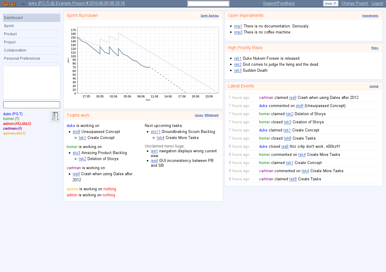
This could be something as simple as a created vs closed time chart. Example below:

This might be better suited for a new metrics-style page.
What makes this feature interesting?
As mentioned here, the page itself is rather boring and just a wall of text.
By breaking this information out into a simple visual, it can provide managers (or even users) a nice at-a-glance view of how things are going.
While I think more "involved" charts (burn-up or burn-down) are probably better suited for a more full-featured "project management" suite or a plugin, something simple and straightforward like this seems suited and well-fitting for a pure ticket tracking system.
Additionally, it may be novel to have, in addition to a sliding window of ticket activity, to also maintain either one or two pie charts with regards to the breakdown (defect, feature, enhancement, task, or even 'custom' types) of ticket type.
If using two charts, one chart could be for closed tickets and one chart for open tickets. If using a single chart, it should simply contain everything.
These graphs should be project-specific. When this ticket is implemented, adding installation-level charts would be a plus.
Ticket History
- Milestone 3.0.7 3.2
- Milestone 3.2 3.3
- Milestone 3.3 3.4
- Milestone 3.4 4.0
- Status New Accepted
- Assigned to Jack
I think it really depends on how much you want to get out of the page - a major release/rewrite like 4.0 is as good a time as ever to do something like that.
Having the activity/status feed page is a definite plus - a quick way to see which tickets have been getting worked on recently without having to wade through things you don't care about.
Things to enhance this:
- RSS feed (or similar) [might already be present; never looked personally].
- Installation overview. Currently you get the feed per project. For sites which have multiple projects, it would be nice to have a full overview of any activity (permissions permitting) at a glance.
- A daily/weekly/monthly summary email push/subscription system for users who want to receive information about activity but don't want every detail (consider "executive summary"; maybe a good place to inject charts as an html-based email).
For the charts, you've got a number of options. Personally, I'd see it broken down into a few sub tabs:
- Current/Future milestones (burndown charts [example])
- Historical data (all-time/yearly/monthly/weekly/daily activity visualization [like original screenshot]). Possibly better to split into multiple line charts rather than fill charts.
- Type metrics (pie charts, bar charts, etc.) like you've mentioned. Could be a simple all-time-only page, or you could break it down into time slices similar to the historical data tab.
- Contributors tab ('leaderboard'; 'rankings'; possibly an activity visualizer). Mostly just for novelty; however, under certain situations it could be considered useful.
- For all of these, apply the installation-level overview suggestion number 2 from above for charts as well.
With that said - and if desired, would make sense to split to another ticket and probably 4.x+ or 5.0+ - perhaps pick a good set of chart types you can implement for the 4.0 release, pick a good number of visualizations, and the feature set of the software will have improved regardless.
Once you've got that in place (chart types, data input types), generate an API/configuration page for allowing users to setup their own visualization "pages" - let the installation/project admins determine which metrics are useful to visualize and which are not.
- Milestone 4.0 4.1
- Milestone 4.1 3.10
Development on 4.0 has began and I will be reworking the pages as I go through and get them working with the new framework.
I'm currently trying to plan out the new timeline page. I was thinking of splitting it into two pages.
I was thinking an Activity page, which would be the current style of the timeline and a Visual/Metrics page that has the charts for open, closed and started issues, a chart for issues by type, possibly a few others.
What do you think?
I want make the timeline useful and get it right for the 4.0 release. Feel free to add some ideas. If you have any examples of something you think would look good please share.